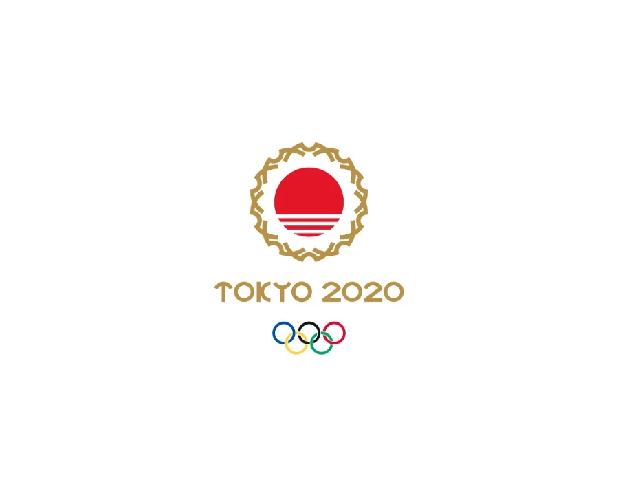
I have a deep interest in branding and logo design. When the initial logo for the upcoming summer Olympics was revealed, it was greeted with a mixed reaction - I thought it would be fun to come up with my own treatment for the event. I drew a great deal of inspiration from the 1964 logo used for the same venue. I used the tip-shape of the iconic Cherry Blossom to create an abstract wreath/frame, with a series of lines to nod to Japan being ‘the land of the rising sun’. I chose to keep the color application flat and clean, paying homage to original ‘64 logo. I then developed a font to match the Cherry Blossom wreath.